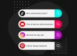

Customers aren’t happy with the new Cracker Barrel logo.
We’ve assisted with brand designs for the government and nonprofits. While those designs don’t leave room for fancy fonts and bold colors, they do tell a story. The same way your smile invites someone to say hello, logos are a welcome, an invitation to get to know a brand. The colors, the font, the message – it is all the same. Buy us. Trust us. Use us. And usually, we listen.
Now, let’s talk about one of the most buzzworthy stories of the week. The logo redesign of Cracker Barrel. They are having a week, and customers aren’t afraid to tell them to shove the new logo and try again. I will note, I only eat there if someone invites me to join them for a meal. Let’s take a look at why logos are meaningful:
That rush you feel when you see a brand you love isn’t just a coincidence—it’s a carefully crafted emotional response. Your brain treats a well-designed logo with the same pleasure it gets from seeing a good friend, hugging a loved one, or even winning a prize. It’s a high that signals happiness and comfort, an unconscious reaction that goes deeper than conscious thought.
Brand loyalty isn’t just about a good product; it’s an emotional connection. We are inherently loyal to what we know and trust, and for brands, this trust is built through consistency. The colors, shapes, tones, and typography of a brand’s logo and overall identity work in unison to set a mood. Think of the vibrant red of Coca-Cola, the golden arches of McDonald’s, or the sleek, minimalist design of Apple. These aren’t just symbols; they are psychological triggers. The colors red and yellow, for instance, are known to stimulate appetite and energy, which is why they are so prevalent in the food industry.
This emotional bond is what separates a product from a brand. A logo acts as a shortcut for the mind, instantly bringing up a wealth of positive associations and memories. The comfort of knowing what you’re getting, the anticipation of a satisfying experience—it’s all bundled into that single visual cue. Companies invest millions in creating and maintaining these brand identities because they understand that a powerful logo is more than just a picture; it’s a promise of an experience. It’s a tool for building a relationship with the customer, one that transcends the transactional and becomes deeply personal. In a world of infinite choices, that emotional connection is the ultimate differentiator.
The issue with Cracker Barrel is it is a step away from the heritage or legacy of the brand…I mean can you stay Cracker Barrel without seeing an actual barrel? It also feels cheap and like a Canva knockoff exclaimed one person, which means it is not eye catching for them. Before rebranding think about customers and what they want, need and will support.